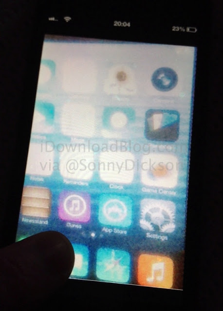
The image depicts the stock applications having "flat" icons without any signs of skeumorphism and gloss. Graphic designer Surenix has redesigned and recreated the image in a much formal fashion as can be seen below.
| Surenix's rendition |
However, Surenix's rendition clearly suggests that this iteration of Apple's mobile operating system will be very old-school.
So, let's wait and see what Jonathan Ive has been upto (actually he is the heading the design department of Apple). I am afraid that this will be a huge disappointment and surely a lot of people would make a switch to Android for sure or stay on the more robust iOS 6, like me.
Let's hope the fruit company includes useful new features and makes the UI much more appealing than its predecessors.
[[ source ]]


No comments